Yoga Alliance
Website Redesign
Solo Project
4 Weeks
In a world where yoga plays a crucial role in wellness, the Yoga Alliance website presented challenges for users seeking certification and yoga practice guidance. As part of a self-project, I redesigned the website to improve user experience, creating a more intuitive, engaging platform. This case study outlines the process, completed over one month, to meet the needs of both yoga professionals and the public.
THE PROBLEM
A tangled path to certification & resources…
Navigating the Yoga Alliance website was a frustrating experience for users due to confusing navigation, limited search functionality, and inaccessible key information. These challenges hindered yoga professionals and enthusiasts from easily finding certifications and resources, impacting their engagement with the platform.
SOLUTION
An effortless journey through intuitive design..
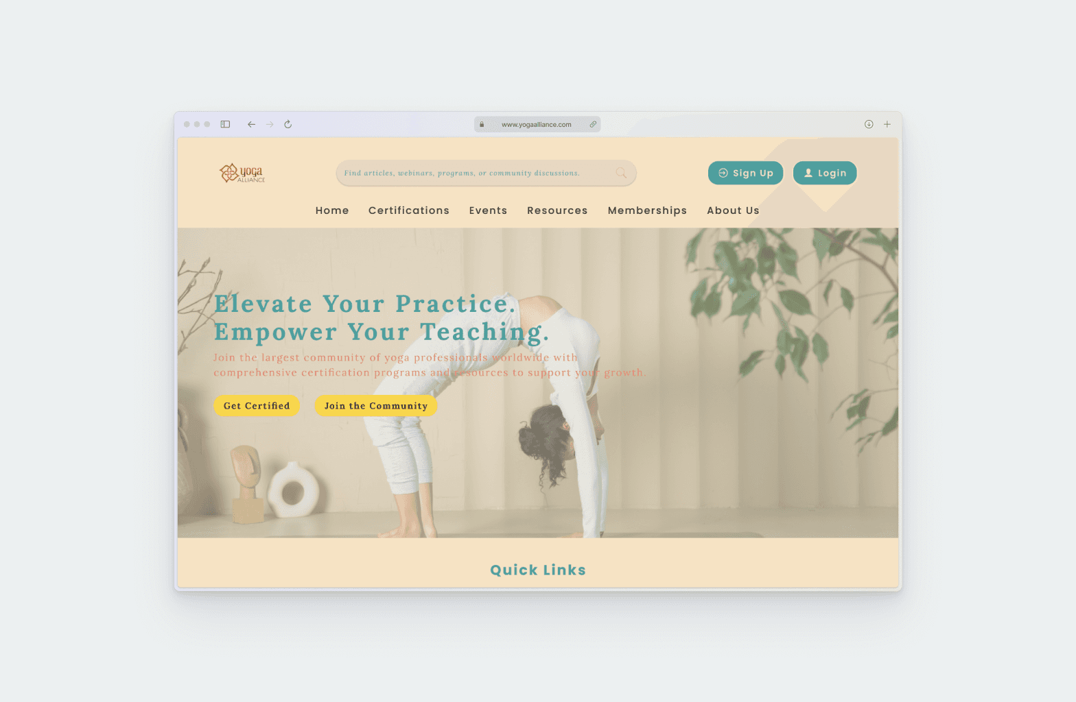
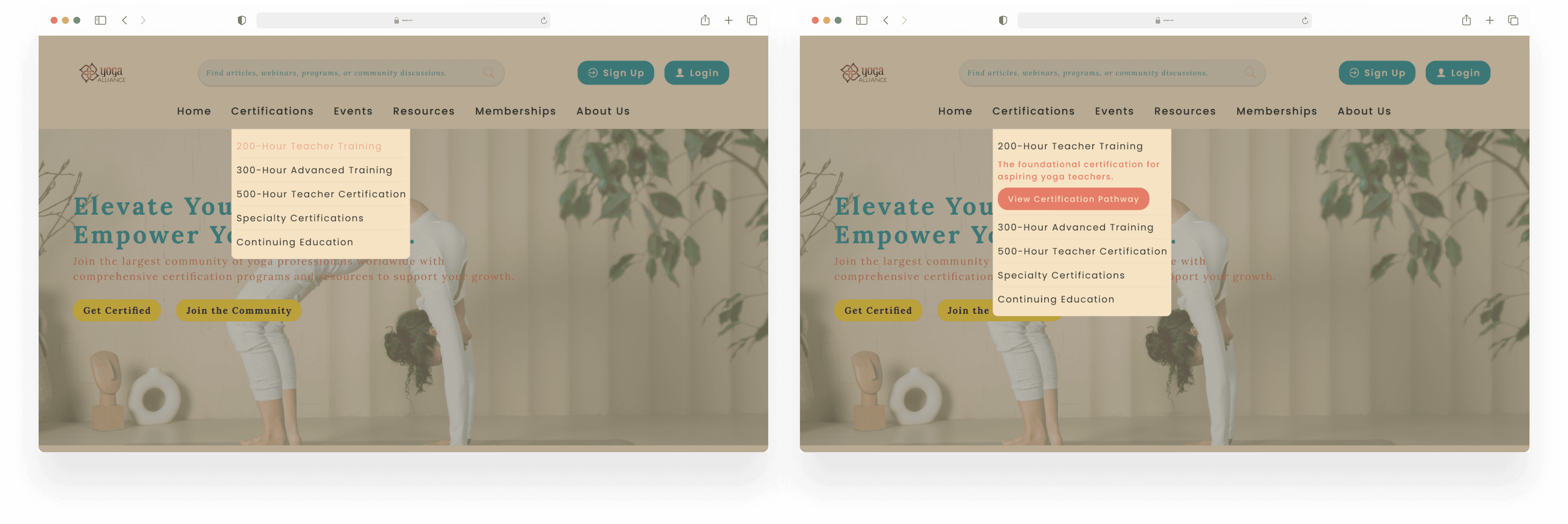
1. Simplified Navigation with Clear Hierarchy
A well-structured navigation system ensures users can quickly locate key sections like Certification, Resources, and Community.
Improved organization reduces confusion, resulting in a smoother and more intuitive browsing experience.
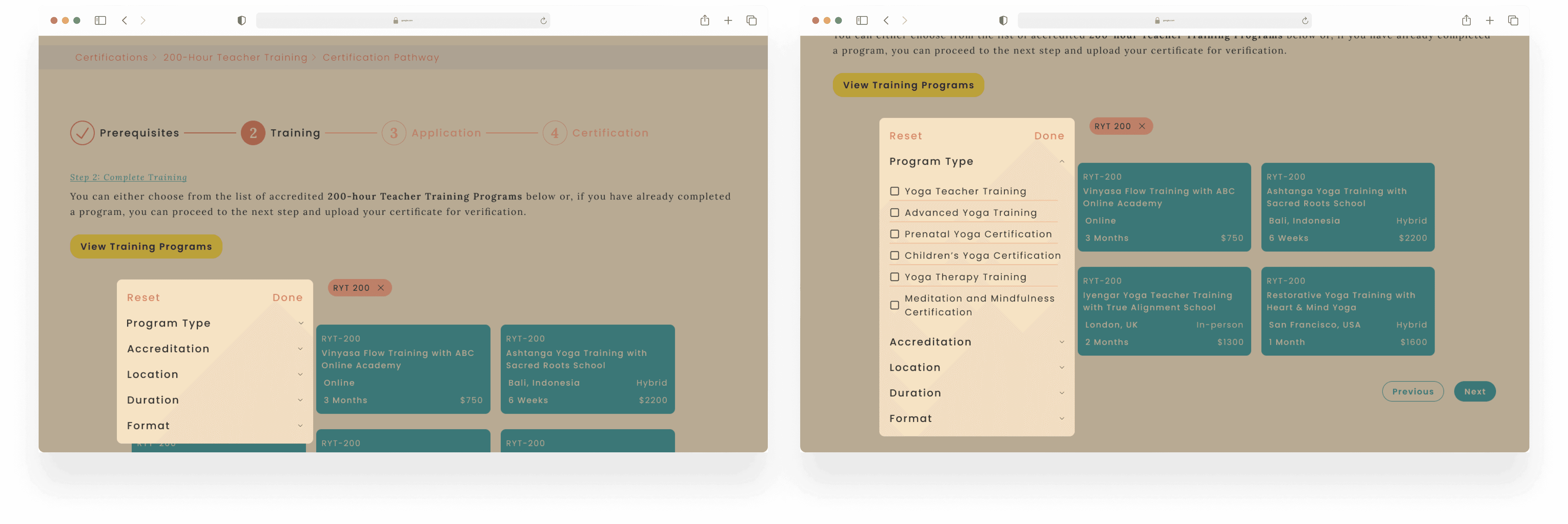
2. Advanced Search with Smart Filters
Filter options for certification level, resource type, and topics offer more precise and relevant search results, saving users time.
Enhanced search functionality reduces frustration, allowing users to focus on finding the specific information they need.
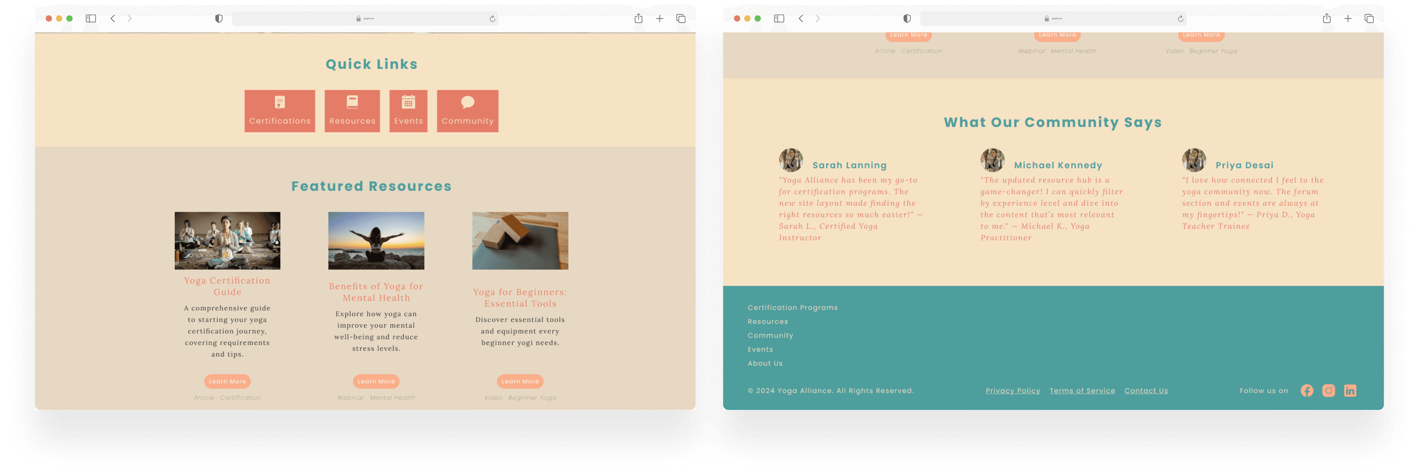
3. Building Community through Interactive Features
Discussion forums create a space for users to connect, share experiences, and seek guidance from others in the yoga community.
The events calendar promotes engagement by keeping users informed about upcoming workshops, trainings, and activities.
User testimonials add authenticity and inspiration, fostering trust and deeper connections within the community.
Navigating the redesigned experience...
RESEARCH
Uncovering user frustrations & needs… to design a clearer, more intuitive journey.
In this phase, I focused on gathering insights to understand user needs and existing pain points within the Yoga Alliance website. Heuristic evaluation was conducted to identify usability issues based on established design principles. I then distributed user surveys to gather quantitative data from practitioners to capture their experiences, preferences, and challenges. Then, I organized a card sorting exercises to categorize content intuitively, which informed the site structure and navigation design.
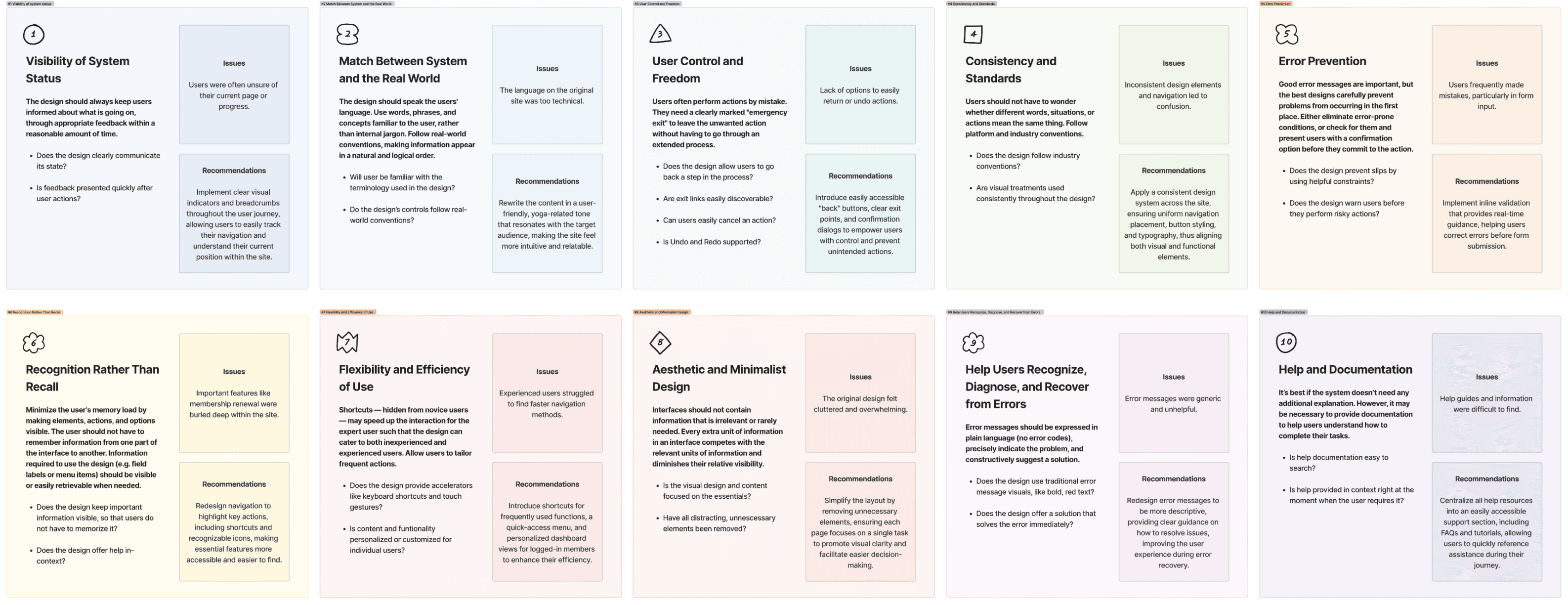
Heuristic evaluation
Clarity, simplicity & connection…
I conducted a heuristic evaluation by comparing the website against established usability principles, identifying key usability issues that hindered the overall user experience.
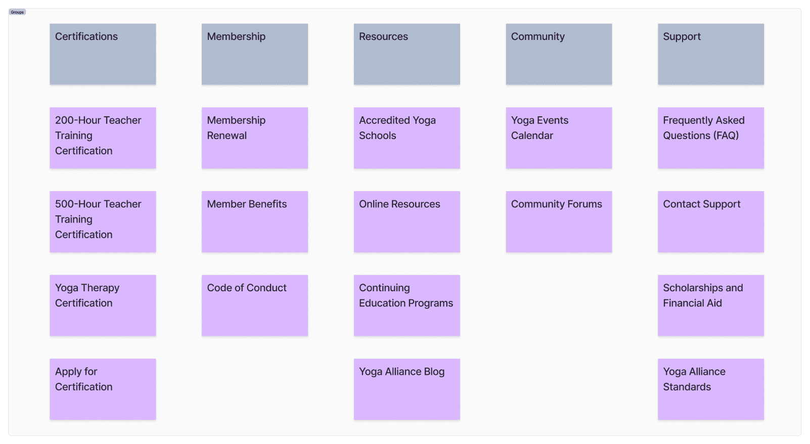
Card sorting
Aligning Navigation with User Mental Models
10 Participants were provided with a list of 20 cards, each representing a piece of content or a feature on the Yoga Alliance website. Their task was to sort these cards into groups that they felt belong together.
ANALYSIS
Turning data into empathy…
In this phase, I focused on gathering insights to understand user needs and existing pain points within the Yoga Alliance website. Heuristic evaluation was conducted to identify usability issues based on established design principles. I then distributed user surveys to gather quantitative data from practitioners to capture their experiences, preferences, and challenges. Then, I organized a card sorting exercises to categorize content intuitively, which informed the site structure and navigation design.
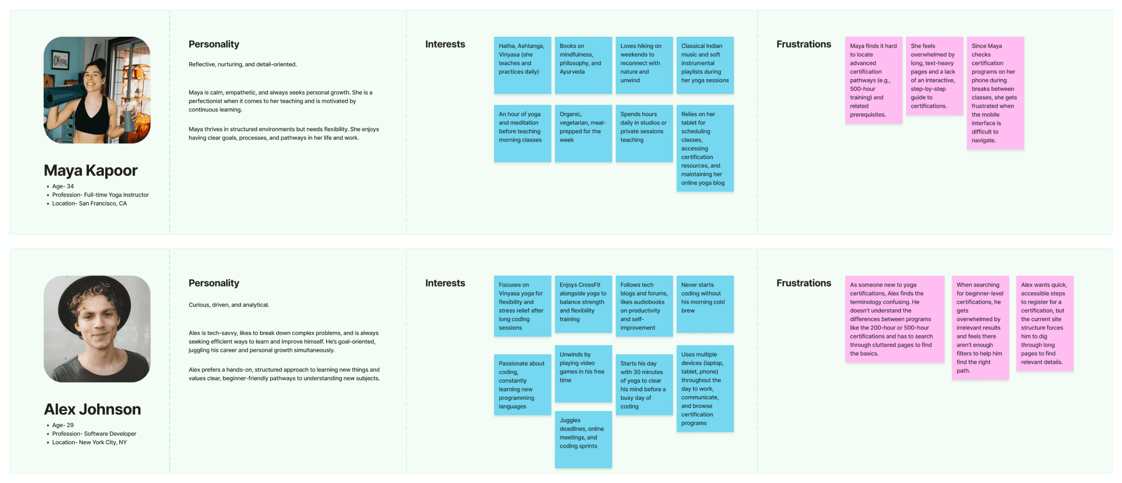
User persona + Gathering Insights
Simplify, personalize & mobilize… tailoring the experience for every user’s journey
I created user personas to represent the target audience, based on insights from surveys and research.
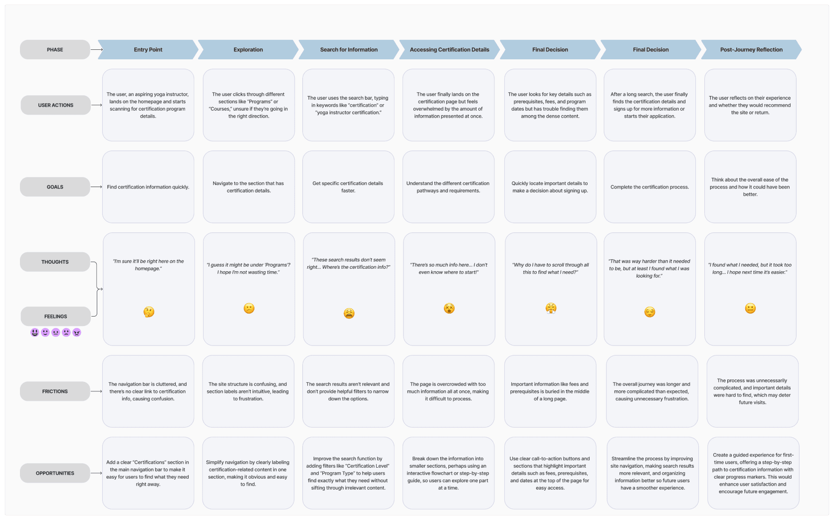
User Journey
Streamline, filter & highlight… guiding users to certification clarity
I developed a journey map to visualize the steps users take to find certification information. This process highlighted pain points like difficult navigation and overwhelming content. By mapping the journey, I identified opportunities to streamline the experience, making it easier for users to access relevant certification details quickly and efficiently.
HOW MIGHT WE…
CONCEPT DEVELOPMENT
Designing with purpose...
The main goal of the concept phase was to translate research insights into actionable design solutions by mapping intuitive user flows and visualizing key interactions, ensuring usability and accessibility.
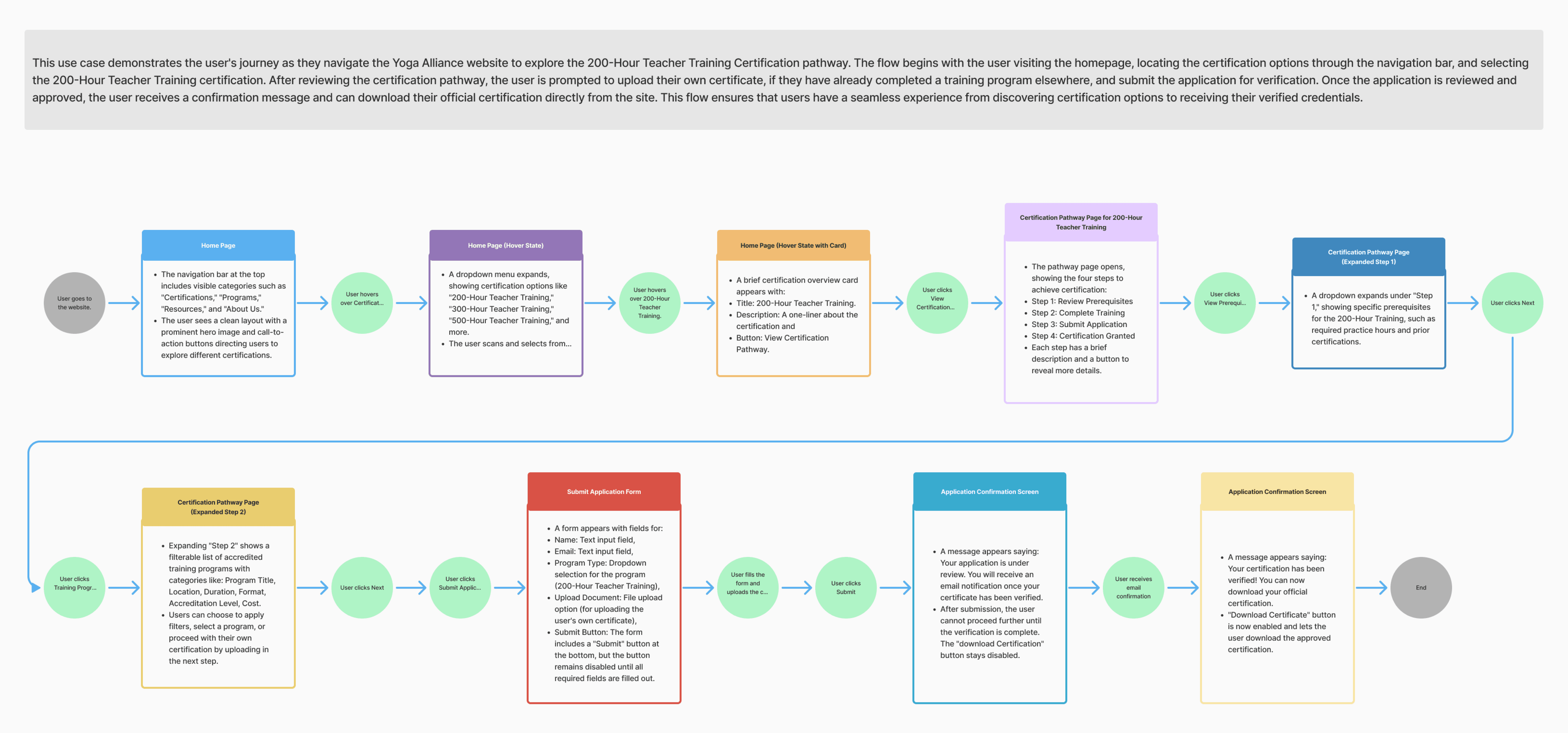
Flow diagram
I created a flow diagram to map out the user's journey through the website, highlighting key actions like finding certification information. This helped identify pain points in the navigation flow and streamline the process, ensuring a smoother, more intuitive user experience in the redesign.
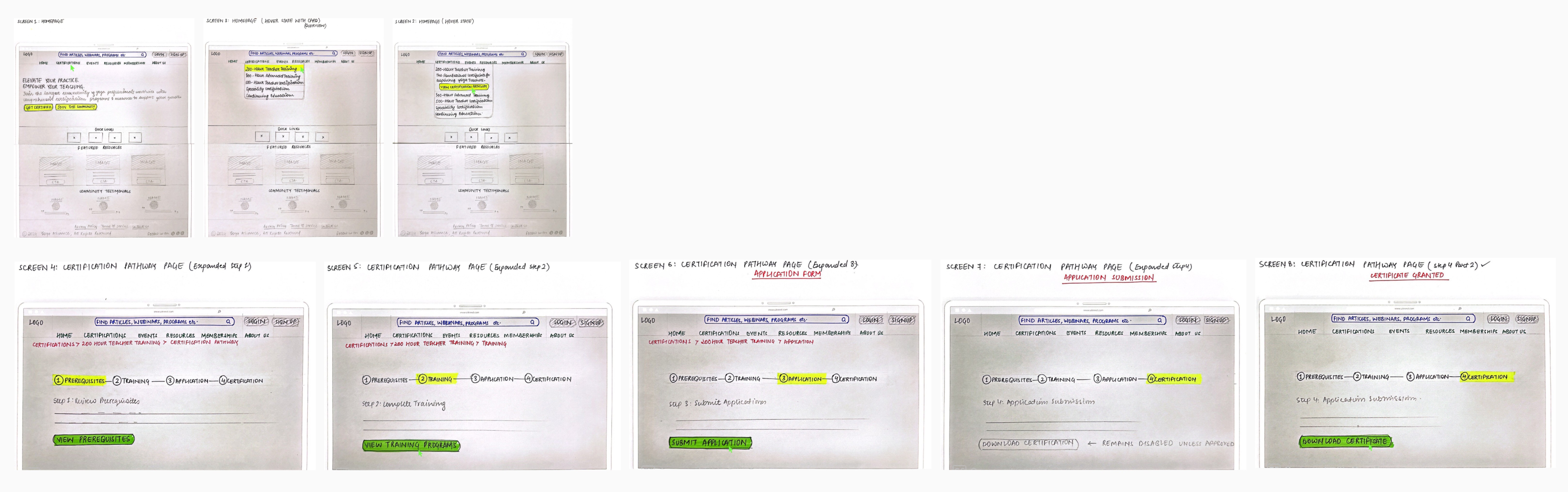
Interaction design sketches
I began by sketching key interaction points to visualize key components like the navigation bar, search functionality, and community engagement features. These sketches allowed me to experiment with different layouts and interactions, ensuring that the redesign focused on usability, accessibility, and a seamless user flow.
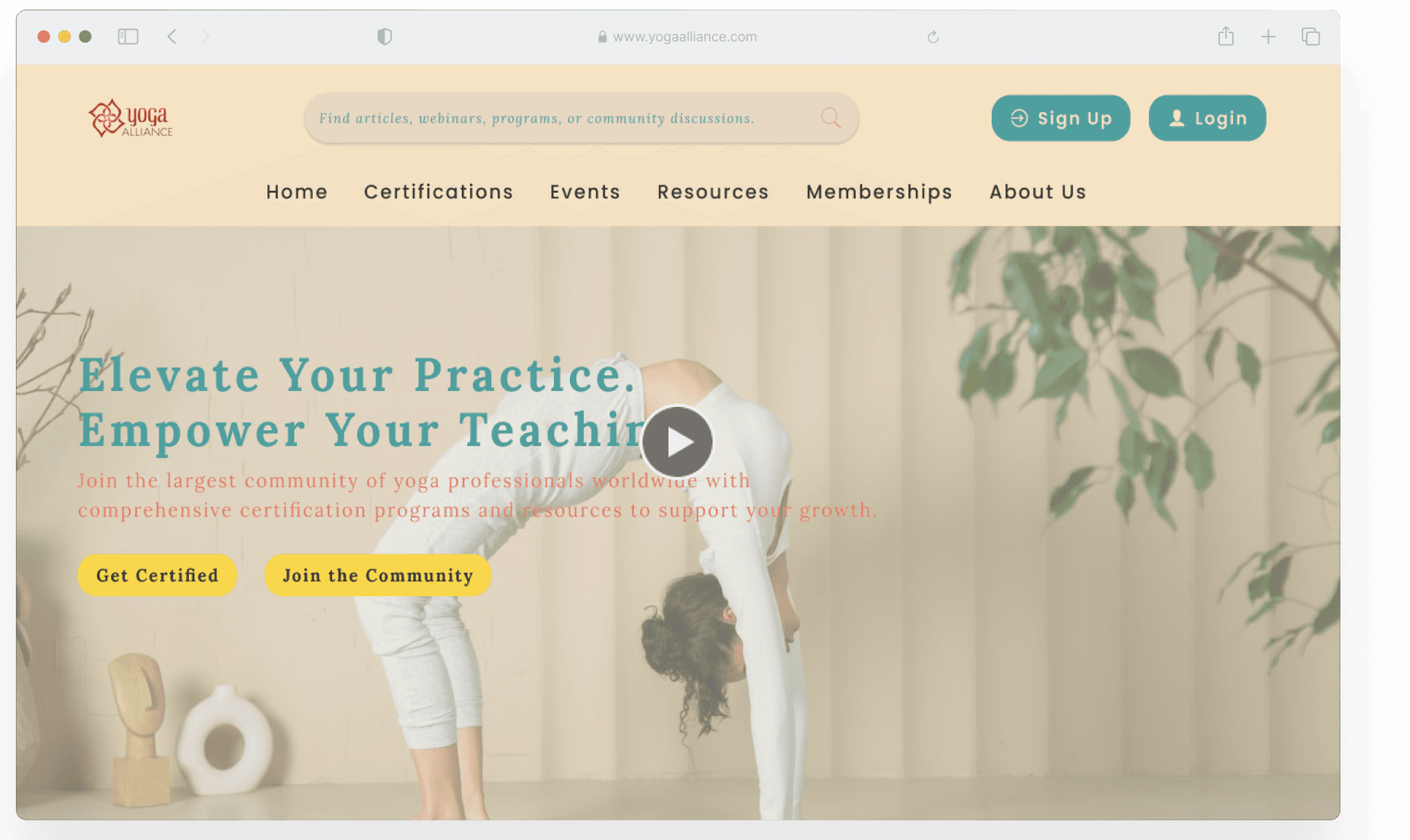
FINAL SOLUTIONS & DESIGNS
These design improvements focused on making the Yoga Alliance website more intuitive, engaging, and user-centric. By introducing a clear navigation system, advanced search filters, and interactive community features, the redesign addressed user frustrations and enhanced accessibility. The result was a platform that not only simplified finding information but also fostered meaningful connections within the yoga community.
PROTOTYPE
STYLE GUIDE
The design decisions..
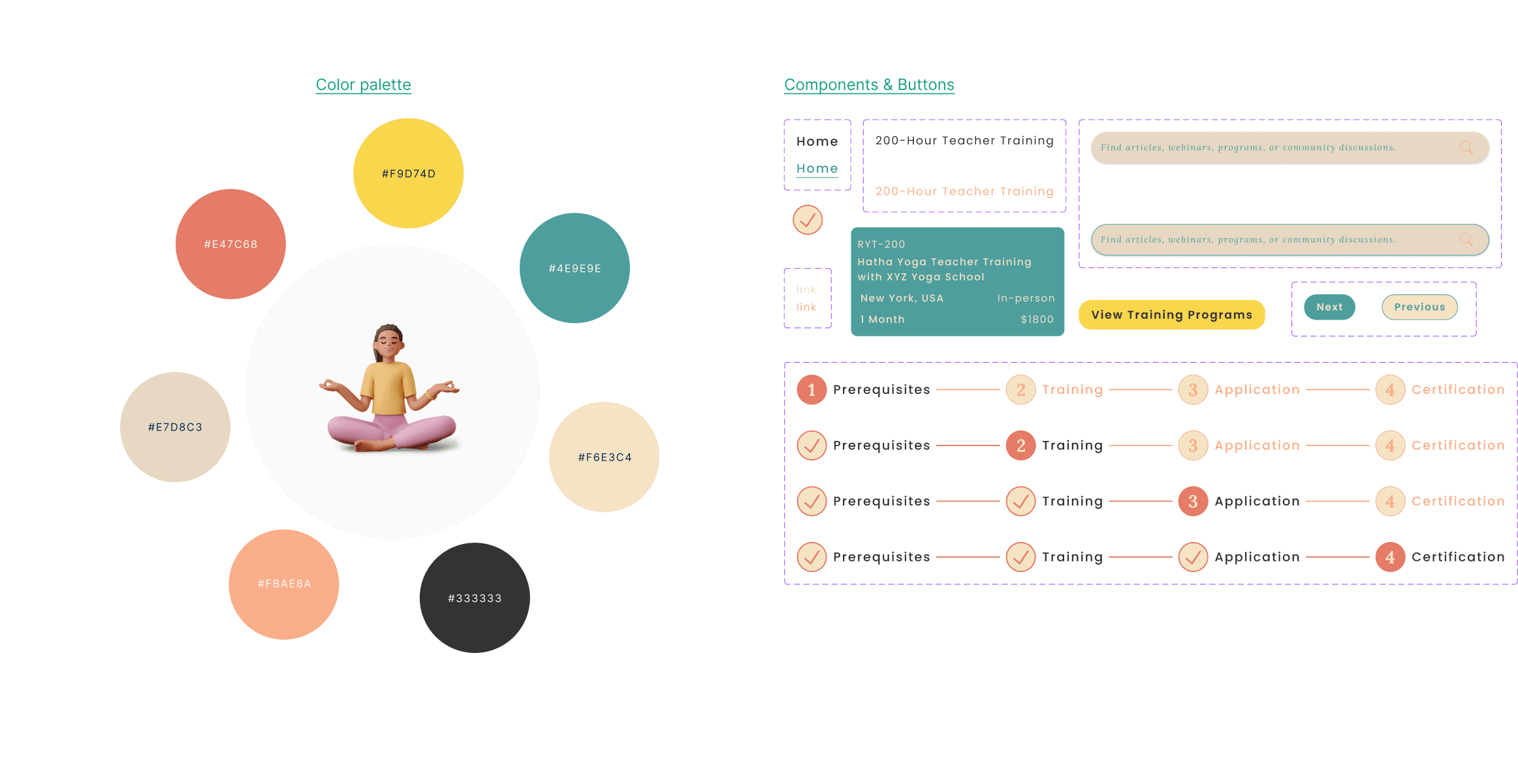
Want to know the story behind each hue chosen for the Yoga Alliance website re-color?
CONCLUSION
What I would do differently next time..
This project taught me the value of adaptability and problem-solving in tackling complex user challenges. By focusing on real user needs and iterative design, I created solutions that addressed key pain points. However, I recognize the importance of incorporating more diverse user profiles and conducting frequent testing to enhance inclusivity and catch issues earlier.
Next time, I’d invest more time in exploring deeper solutions during the research phase and refining ideas upfront. Additionally, adopting agile methods and conducting more usability tests would streamline the process, ensuring a smoother workflow and even more impactful outcomes.
Link to full figma work file here HERE
[NEXT PROJECT]