Flyhigh
Mobile Application
Solo Project
12 Weeks
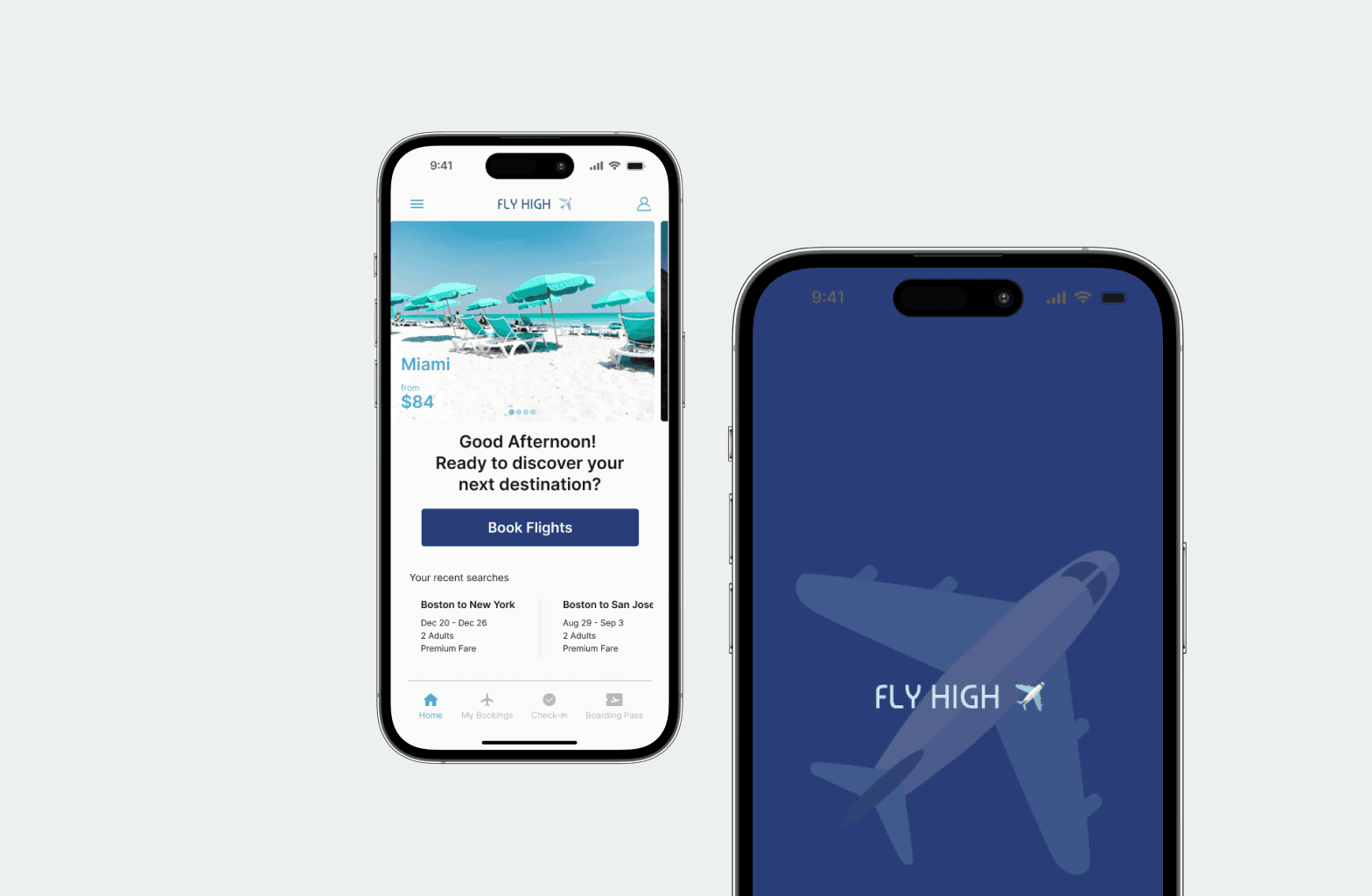
Fly High is a fictional airline app created to deliver a seamless booking experience for users. The goal was to simplify flight searches, improve fare transparency, and streamline the booking process. As the lead UX designer, I was responsible for research, concept development, and final design execution. This project, completed during my UX Design Institute diploma, was a pivotal learning experience, blending both my visual design background and new UX skills to address real-world user challenges.
THE PROBLEM
Booking Flights Shouldn’t Be Turbulent
Do you struggle with cluttered airline apps, confusing fare structures, and overwhelming options, wishing for a streamlined and transparent booking experience that makes flight planning easier from start to finish?
SOLUTION
A transparent airline booking experience..
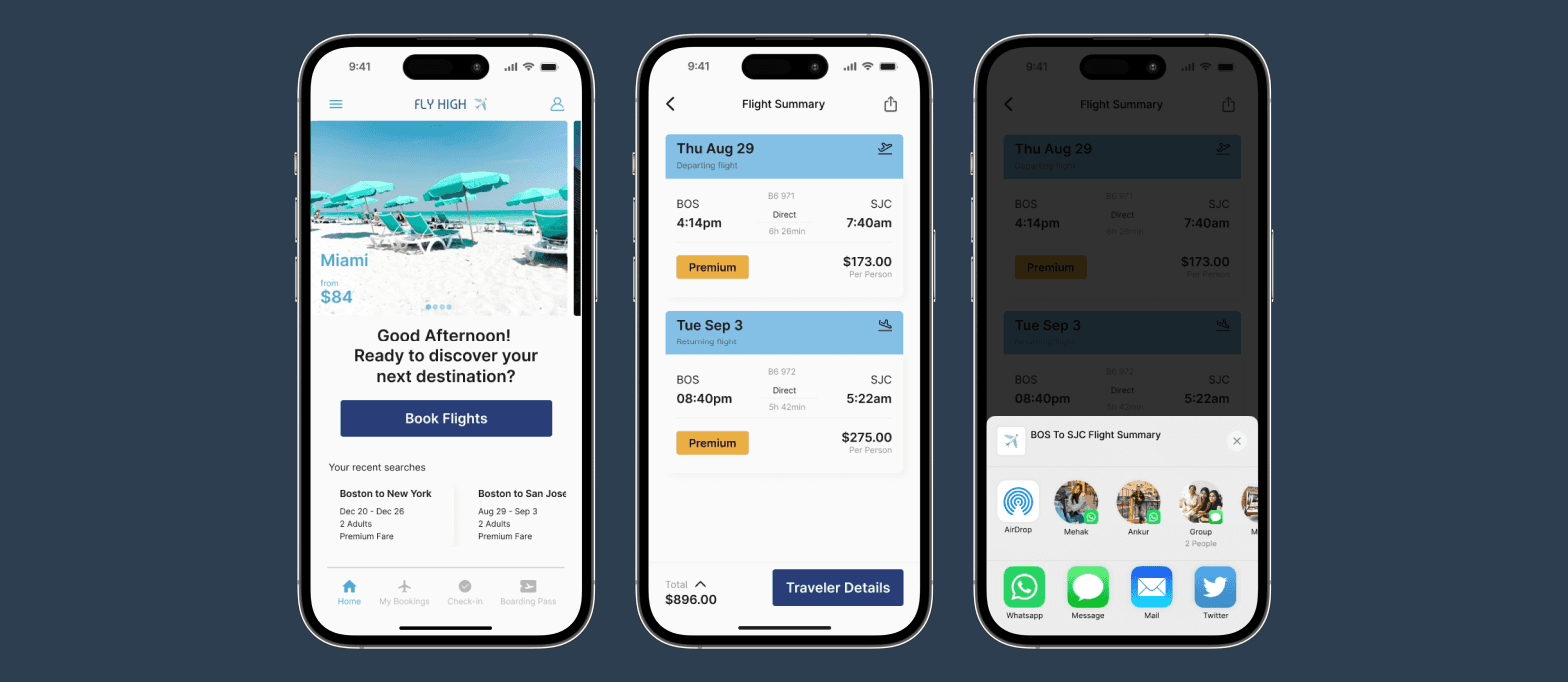
1. Simplified Access with Recent Searches and Sharing
Recent search functionality allows users to quickly resume where they left off, saving time and effort.
The share feature supports collaboration for group bookings, making it easier to coordinate travel plans with others.
2. Transparent Pricing with Early Fare Selection
Displaying fares on the calendar ensures users can compare prices easily, avoiding surprises later in the booking process.
Improved transparency helps build trust by reducing hidden costs and giving users greater control over their choices.
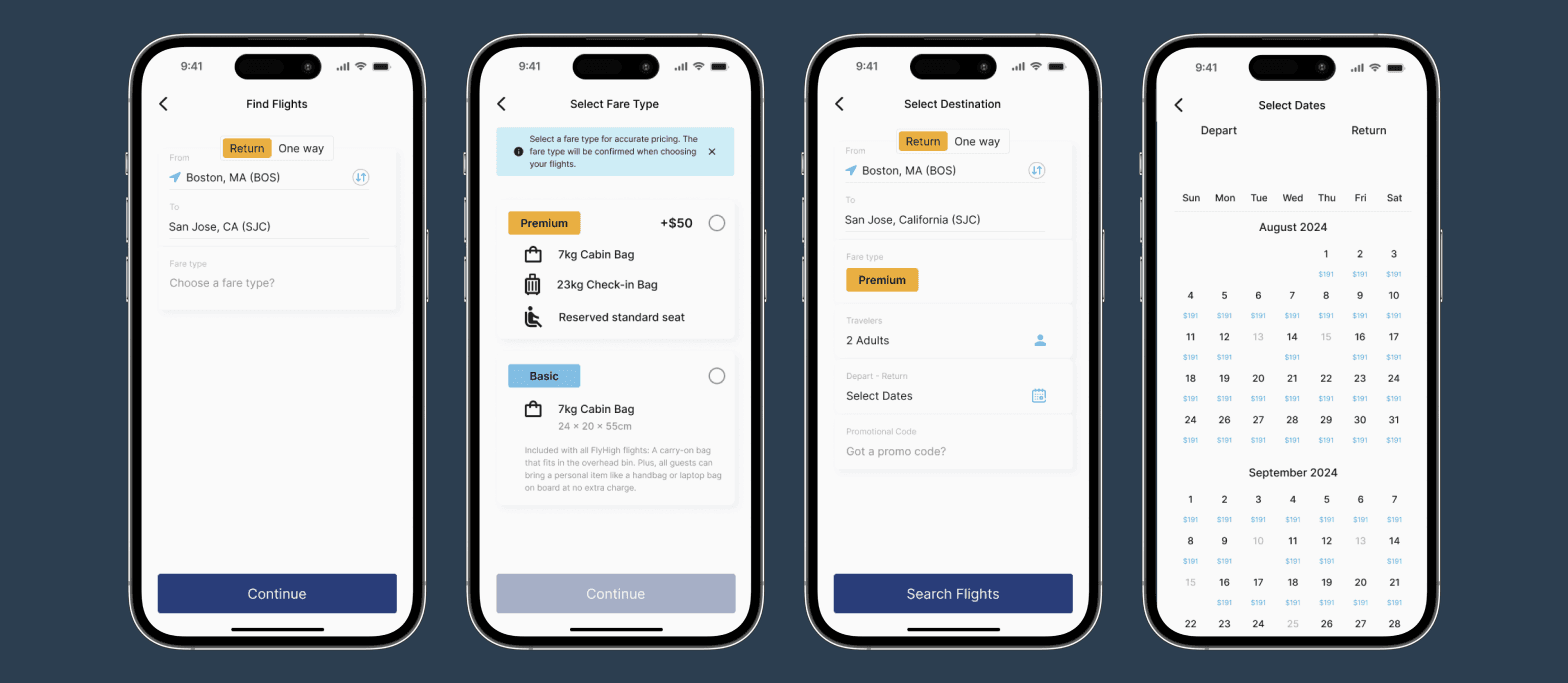
3. Clear and Concise Fare-Type Displays
Streamlined fare-type screens provide users with only the necessary information, reducing cognitive overload.
A constantly visible total price offers clarity and reassurance, so users always know what they’re paying.
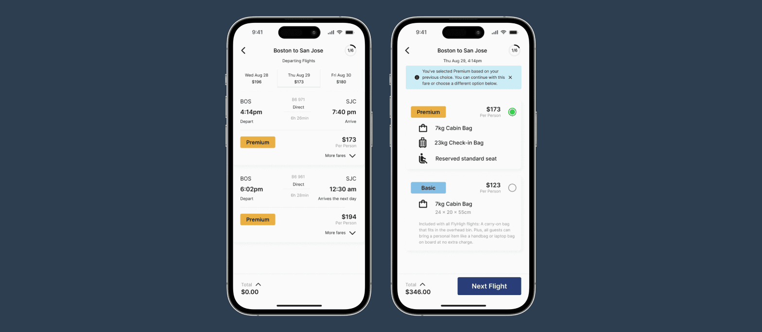
4. Guided Booking with Progressive Disclosure
Progressive disclosure helps present information in digestible steps, preventing users from feeling overwhelmed.
A visible progress counter ensures users always know where they are in the process, improving confidence and flow.
RESEARCH
Users value transparency, ease of use & trust… but still face hurdles in the booking process.
The research goal was to deeply understand user frustrations and behaviors in the flight booking process, uncovering pain points and opportunities to create a seamless, intuitive experience. By analyzing competitors, gathering user insights, and testing real interactions, the aim was to design a solution that addresses key challenges like pricing transparency, navigation complexity, and user trust.
Competition benchmarking
Seamless booking starts with clarity, convenience and trust…
To start, I conducted a comprehensive competitive benchmarking study by reviewing and comparing the booking processes of American Airlines, Delta, JetBlue and Google Flights. This analysis helped me identify their strengths and weaknesses, revealing opportunities for improving Fly High, such as simplifying the booking process and enhancing pricing transparency.

User Interview
Simplifying the journey by removing distractions, adding flexibility & putting users first…
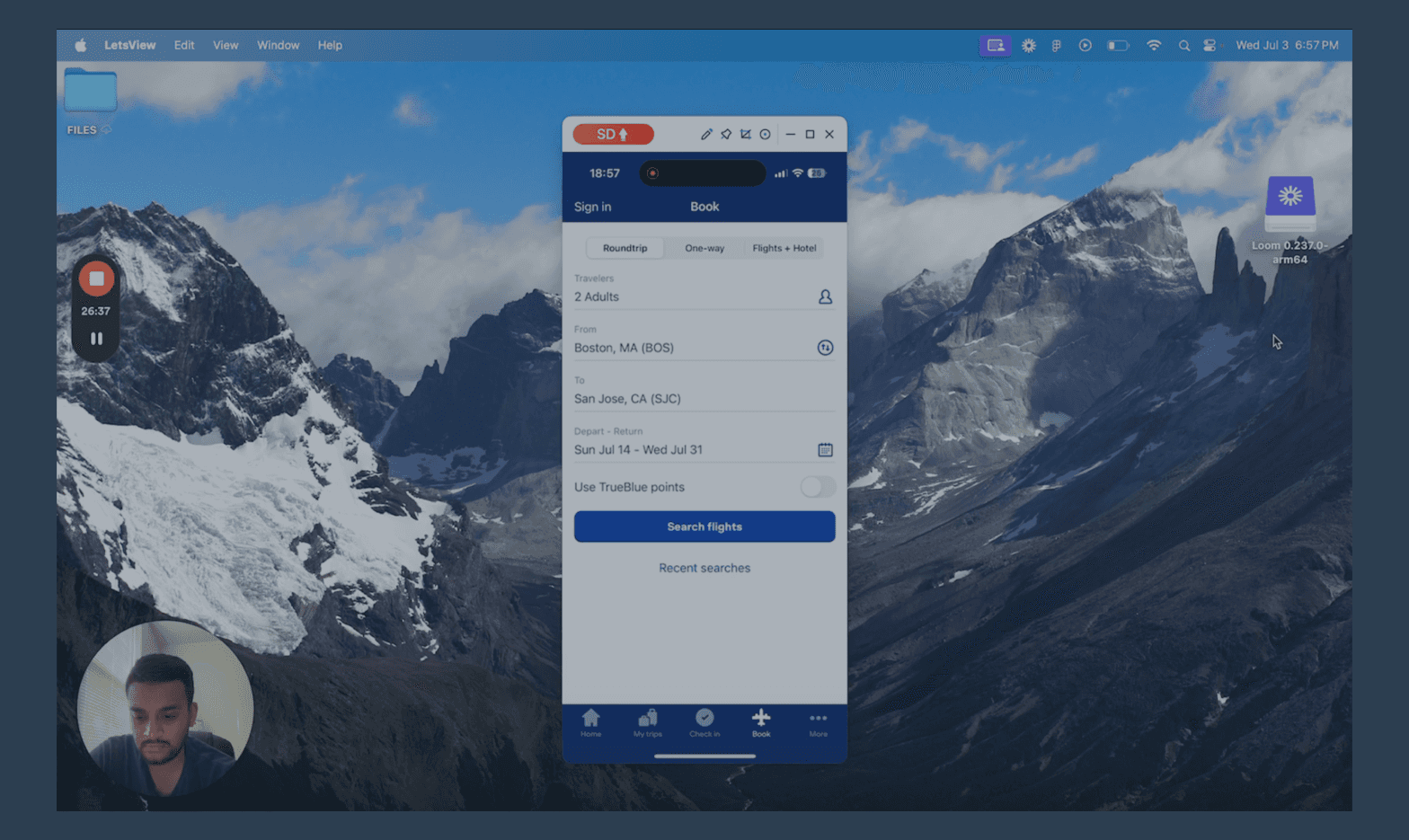
I conducted usability tests with a friend who had recently booked flights through an airline app, observing their interactions with Delta and JetBlue apps as they completed a flight booking from start to finish. Using screen mirroring and recording software, we explored the booking process together.
ANALYSIS
Turning data into actionable insights…
The analysis phase aimed to distill user feedback into clear, actionable themes through affinity mapping, providing a deeper understanding of key pain points to guide user-centered solutions. 120+ data points later.....
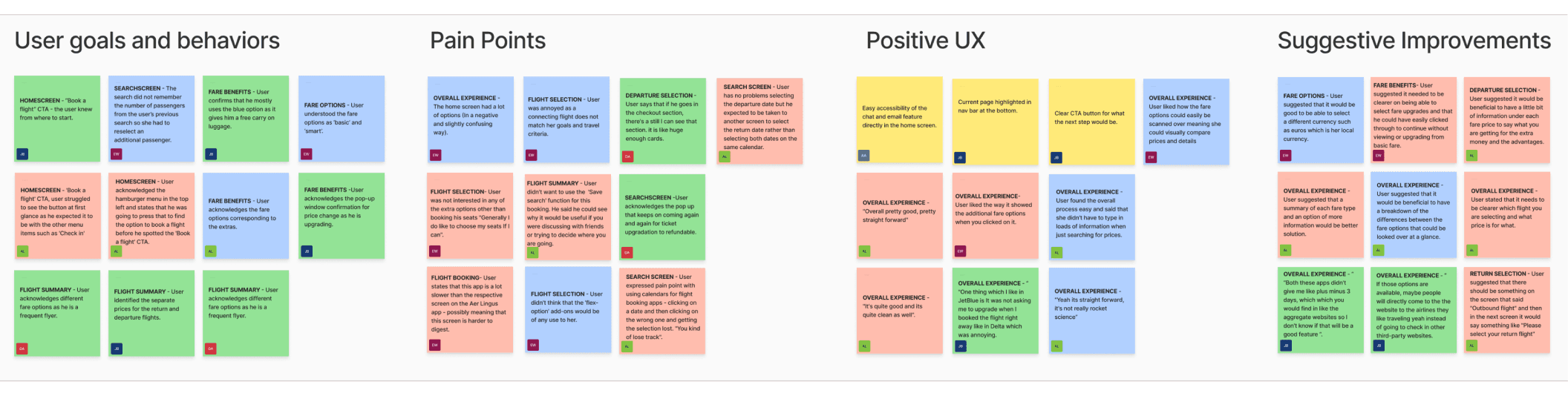
Affinity map + Gathering Insights
Clearer choices, smarter defaults & fewer surprises…for a friction free experience!
After completing the user research, I synthesized the data using the Affinity Diagram technique, grouping related insights into key themes.
User Journey
..from excitement to frustration.. need to simplify their journey to keep the thrill alive
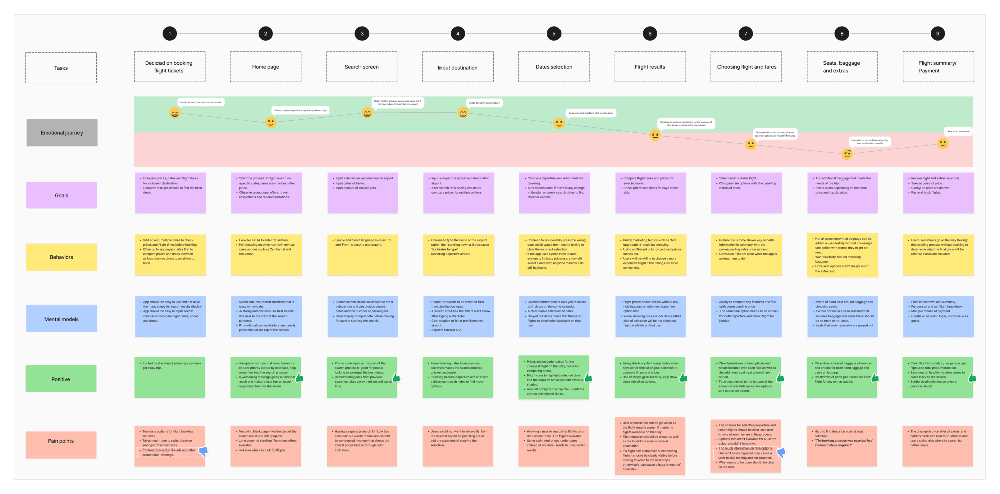
I then created a user journey map to visualize the steps a typical user takes when booking a flight, detailing emotions, actions, and pain points at each stage—from flight search to payment completion. By outlining user goals, behaviors, and mental models for each step, I identified areas needing improvement and tailored the app’s features to reduce friction and align with users’ needs for a smoother experience.
HOW MIGHT WE…
CONCEPT DEVELOPMENT
Mapping out seamless interactions…
The main goal of the concept phase was to translate research insights into actionable design solutions by creating user flows and wireframes that addressed pain points like complex navigation, unclear pricing, and inefficient search, ensuring a seamless and user-friendly experience.
Flow diagram
With a solid understanding of user needs, I moved into concept development by creating a high-level flow diagram for the Fly High app. This user flow outlined every interaction from the home screen to booking confirmation, focusing on simplifying the process and addressing key user problems.
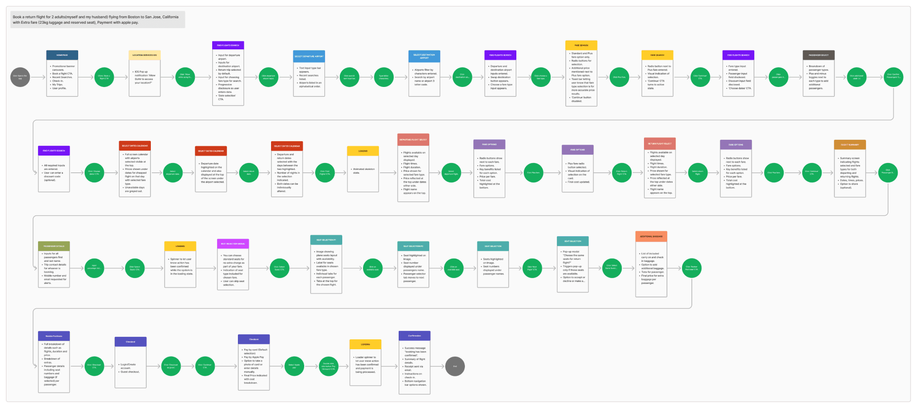
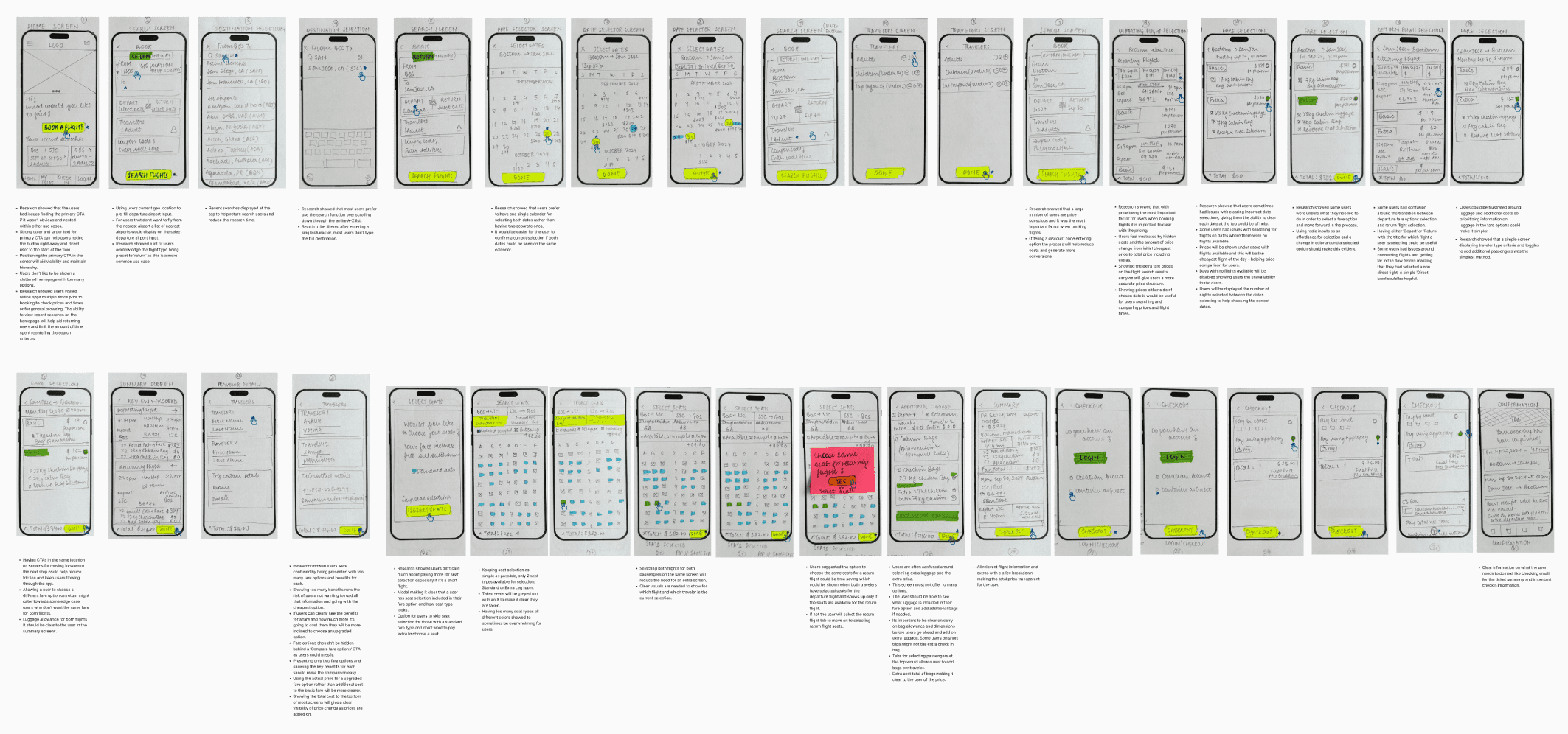
Interaction design sketches
I began by sketching key interaction points, visualizing how users would navigate the app through critical screens like the search interface, flight results, and checkout process. These rough drafts, based on user flow and research insights, allowed me to quickly iterate and address user goals and pain points. Using a phone template and paper, I refined the sketches before scanning them into FigJam to map out the app flow and identify additional screens. By the time I moved into Figma, I had a clear design direction to follow.
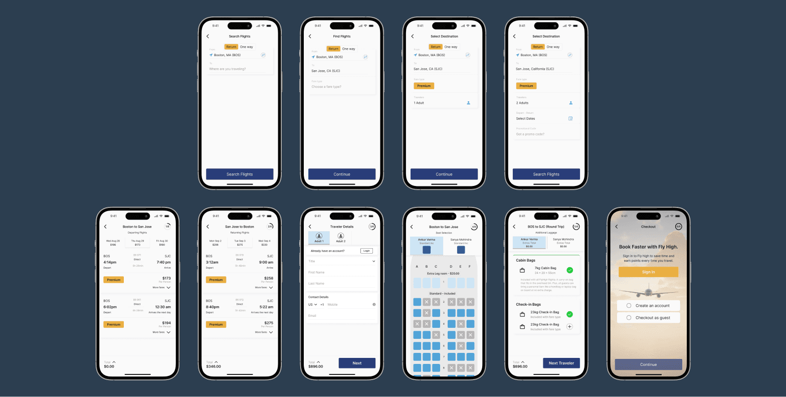
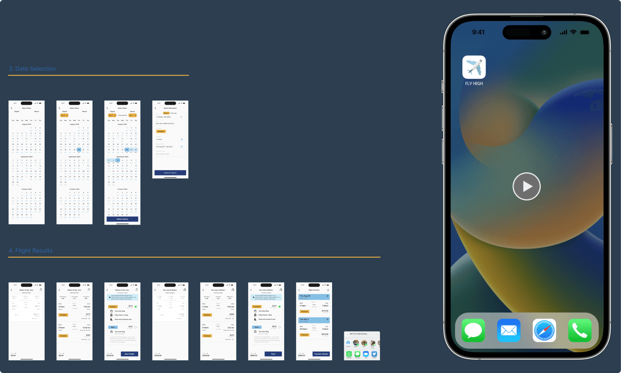
FINAL SOLUTIONS & DESIGNS
These design changes focused on creating a transparent, intuitive, and user-friendly booking experience. By addressing price unpredictability, enhancing search convenience, and simplifying fare selection, the redesign reduced frustration and empowered users to navigate the booking process with ease and clarity. From clear progress indicators to streamlined information, every touchpoint was refined to prioritize user confidence and satisfaction.
PROTOTYPE
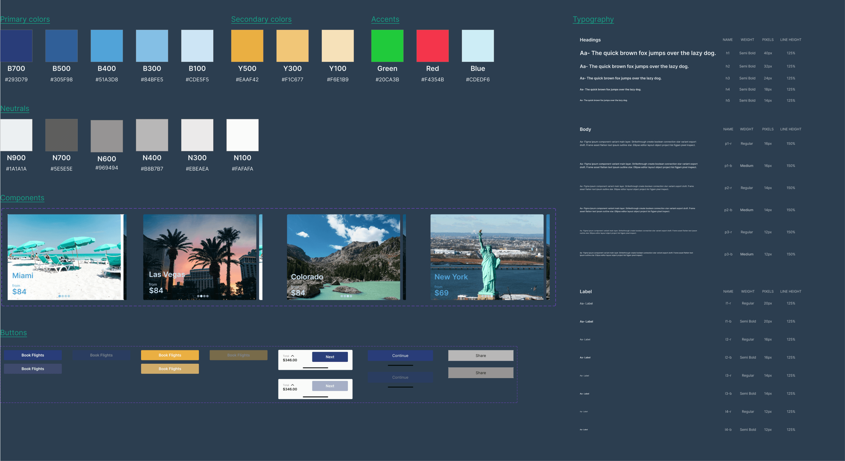
STYLE GUIDE
The design decisions..
CONCLUSION
What I would do differently next time..
Working on Fly High was a truly rewarding experience. Coming from a technical apparel design background, I was able to blend my visual design skills with UX principles, focusing on both aesthetics and functionality. This project was my first complete UX design and it gave me a deep appreciation for the research process and how it drives design decisions.
I realized how essential user research is, as it informs and justifies design choices. I also learned more about balancing design ideals with practical business needs, which is crucial in real world projects.
Next time, I’d prioritize additional rounds of surveys and usability testing to ensure more comprehensive insights. Incorporating accessibility audits early on would help me meet WCAG standards from the start. Finally, I would conduct a final usability test to validate my design decisions and identify areas for refinement before launch.
Looking Forward...
This project gave me the space to focus purely on UX, but it also highlighted the complexity of balancing ideal design with real world business constraints. Moving forward, I’m more aware of how to create not only beautiful and user friendly designs but also feasible, desirable and viable solutions.
Link to full figma work file here HERE
[NEXT PROJECT]